Go straight to the interactive applet
The “curse of dimensionality” is a somewhat dramatic phrase you might not necessarily associate with the less than high-octane world of modelling 22 people kicking an inflatable piece of leather around for an hour and a half. It is however something that the entire field of data science has to contend with.
In a nutshell, when the number of dimensions your data has becomes large (such as a typical table you might find on FBref) strange things start to happen when you apply even the most common data science techniques. Particularly relevant consequences in football analytics are the training of regression or classification models (think xG) which require very large amounts of training data and computation of distance functions (think player similarity searches) which can produce meaningless results. There’s plenty of great material on this issue that can be found with a quick search to understand why this, and other issues, occur. Fortunately there are some techniques you can use that will mitigate these problems. One of these is embedding high dimensional data into a lower number of dimensions.
The goal here is to transform our data in such a way that we can express it for example in a table with say 2 or 3 columns as opposed to the original say 100 columns. But this will only be of benefit if we can preserve the useful information in our 100 column table inside our new 3 column table. There are a number of methodologies that perform this information distillation task, looking for correlation between columns, or features in data science parlance, and working out a more efficient way the relationships between features can be expressed while trying to maximise the amount of variance seen in the original representation that the reduced representation can explain. Principle Component Analysis (PCA) is a well known example of such a methodology.
As a bonus, with dimension reduction we now have a way of visualising our 100 column FBref table which can be used as starting point for finding interesting and useful patterns. It should be stressed that often with dimension reduction techniques the things we associate with similarity visually e.g. distance between points or clusters on a plot, don’t always map to similarity in the data. So extreme care is always needed when interpreting results and the characteristics of the particular technique used must be understood.
“Big 5 Leagues” Player Embedding
As a bit of fun I thought I’d take Tensorflow’s embedding projector for a spin and try out a method of visualising players from the big 5 leagues (English Premier League, German Bundesliga, French Ligue 1, Italian Serie A and Spanish La Liga). This way we can make it fully interactive, try out several dimension reduction techniques with varying parameters, and throw in some player similarity ratings all for good measure. While in reality this has been produced for people to play around with and maybe spark some discussions about which players could potentially replace some other player, the concept of embedding players into a low dimensional space has some very interesting real-world applications. Hopefully I’ll get into one or two of these at some point down the line, and indeed I float a couple of ideas later in this article.
One of the really neat things about the Tensorflow embedding projector is the implementation of Uniform Manifold Approximation and Projection (UMAP) in an interactive setting. UMAP is a state of the art dimension reduction technique which can represent non-linear relationships in contrast to PCA which is a linear method. This means there is the potential for a higher quality lower dimension representation of players, as in a complex system such as a football since we might expect key relationships within data to be non-linear in nature. Also we should recall that PCA keeps the representation in Euclidean space, we’re rescaling the axes of all our dimensions and simply keeping the ones that describe the most variance. In contrast, UMAP represents our data on an entirely different manifold, leading to the possibility of new data structures being uncovered. So let’s briefly state our methodology and then dive in to see if UMAP sheds any more light on how players relate to each other compared to PCA.
Manual Feature Selection
We’ll use FBref as our source and compile data from the “advanced stats” sections available for players. For this exercise I wanted to try to restrict the analysis to representing player style as opposed to player outcomes. Therefore I selected features that have a decent case for exhibiting more of the characteristics of the players themselves rather than the teams they play in. Obviously completely stripping out a team component won’t be possible in many cases, but we can make some choices that will restrict the influence of this component. In addition to general “fairness” techniques such as controlling for minutes played some additional principles were followed:
-
Distribution of actions rather than the outcomes - e.g. proportion of the player’s passes originating in the defensive third rather than number of passes originating in the defensive third per 90
-
Retaining some quantity information - e.g. both the number of aerial duels won and lost per 90 rather than aerial duel win % - this keeps the proportion information in the data but adds frequency context as we may see undesirable extreme values (0% / 100%) for players that only have a handful of duels recorded
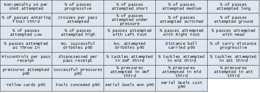
With these principles in mind I’ve gone for the following features that we’ll use to describe the players. There is of course plenty of scope for debate around these choices, so people armed with FBref (or other data sources) can come up with their own. It would be interesting to see how representations vary with different feature selection.
Data Normalisation and Sample Sizes
An important step before chucking data at the dimension reduction algorithm is to ensure that no feature or subset of features dominates compared to others. We don’t want features that can range from 0 to 20 to drown out features that range from 0 to 1, so we rescale all data so that range of all features is 0 to 1.
We’ll also strip out players that have less than 720 minutes of game time to ensure all players have a reasonable sample size for their characteristics to reveal themselves. There’s nothing too scientific about the 720 minute cut-off, I wanted to include as many players as possible (since we’re doing this for fun as opposed to peer reviewed research) whilst not taking liberties. 8 full games seemed a reasonable compromise. We now have 1708 players represented in 34 dimensions.
Inspection with PCA
We’ll select 3 as the number of dimensions we’ll reduce our player data to, mainly because everyone loves cool 3D graphics to rotate and zoom in and out of. We can see these 3 dimensions can explain over 90% of the variance in the input data. Immediately this representation would do a decent job of representing our data if we were to use it as the first stage in model building pipeline. We might expect a good result here as we can note a number of our features would be expected to corelate with each other, such as the tackling distribution and pressure distribution features. As an aside, producing a covariance matrix which calculates the covariance of each pair of features is often a useful first step when getting to grips with a data set.
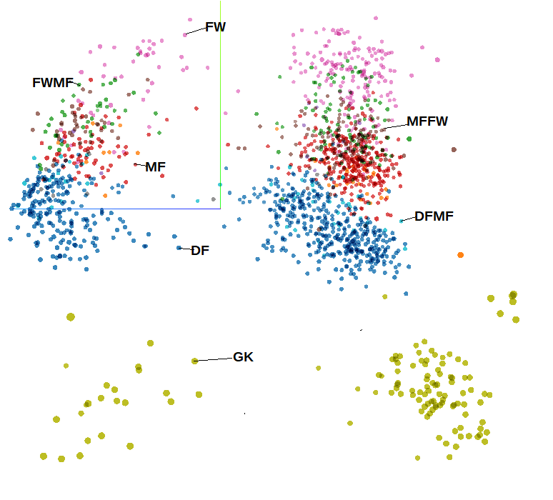
Players represented in 3D space using PCA and coloured using positional meta-data. Note this image is taken from a bird’s eye view so appears 2D
There is some additional meta-data included with the data set used in the applet, that is data that isn’t used as part of the dimension reduction process but can be used to add further description to the data points on the plot. If we add the FBref position label as colour to the plot we can see the dimension reduction has done a good job of identifying positional tendencies straight away. We can also see our data is organised in two clear halves.
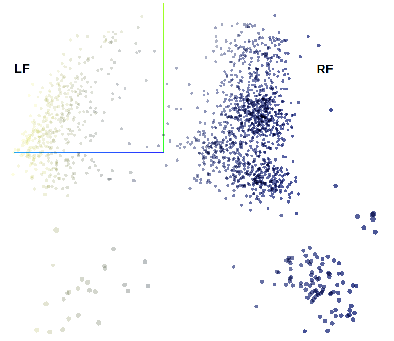
Players represented in 3D space using PCA and coloured using percentage of passes played with the right foot. Note this image is taken from a bird’s eye view so appears 2D
If we colour our points by % of passes played with right foot all becomes clear. Now of course this feature is not meta-data, it was included in the data used for dimension reduction so it hasn’t learned anything new. Rather we can see that it has placed importance of “footedness” by generating a clear distinction in reduced feature space when describing players, which is a nice sanity check. Let’s now see what UMAP can do since there is a rather blurred transition between outfield players with our PCA method, we’ve only really got 4 distinct “blobs” when we remove our artificial colouring from meta-data.
UMAP
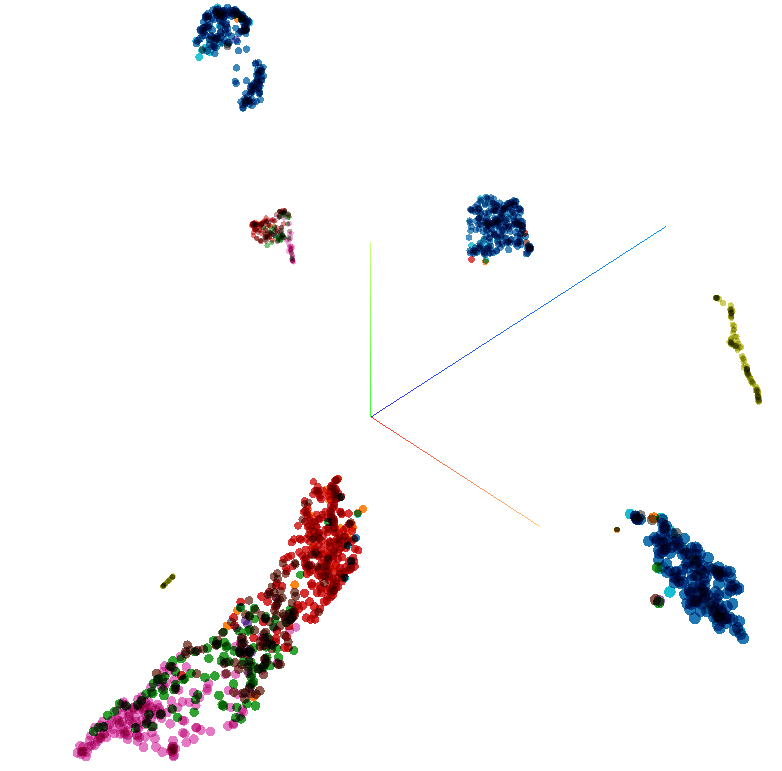
Players represented in 3D space using UMAP and coloured using positional meta-data.
Using the same colouring scheme from before we can see UMAP has successfully identified position categories and footedness, It also has split players with what we might identify as defensive traits away from the outfield monolith and split into two. Could this be defenders with attacking tendencies such as certain full/wing backs? I’ll leave it as an exercise for the reader to explore some of the names that crop up in the various clusters. We’re also using the default parameter for neighbours used in the calculation so I’ll leave it as a further exercise for the reader to see how changing this affects the output.
So what is the point of all of this? Well what we have here definitely counts as a “toy” example so there isn’t much point in this particular case, especially since if you have advanced data about players you are likely to have their positional information as well! However advanced dimension reduction techniques such as UMAP can come in handy in a number of applications including:
-
Clustering - effective clustering such as k-means is difficult in high dimensional space. Dimension reduction beforehand is often used, however PCA doesn’t offer too much help as the “blobs” (or centroids) can be quite ill defined, as we saw in this example in contrast to our UMAP representation. A real world example where UMAP could aid with clustering could be identifying optimal training groups for players (American Football in this example). The late Garry Gelade also did some very interesting work on clustering of possessions. Could UMAP embedding shed further light?
-
Outlier Detection - again UMAP can be used as a pre-processing step to help identify outliers in higher dimensional data. It is mainly a hunch but I believe you could see some interesting results by looking for outliers in pass characteristics embedded in low dimensional space. The rationale being that a trait of top attacking players could be rather than performing x% better with every pass, they identify and execute a small number of passes that most other players do not (which may only number 1 or 2 times per game, if that). These occasions could then be extracted over seasons and across leagues using outlier detection. Just an idea.
Player Similarity
For a final bit of fun we’ll take advantage of the embedding projector’s distance measure calculations to see how players stack up against each other. Here we’re not using the embedding in a low feature space, but rather either a cosine distance or Euclidean distance is calculated from the original high dimensional data. This is because UMAP is a manifold learning technique and as such does not preserve the distances between data points in high dimensional space, instead it looks to learn the distances along an underlying manifold on which the data points lie and so interpretation needs extra care. Likewise although PCA keeps the data in Euclidean space, distances of PCA and original representations would only match if we kept all dimensions for the PCA. Here we only keep 2 or 3 so distance values are not equivalent.
Let’s stop with the theory and get to it so we can find a cut-price Lionel Messi.
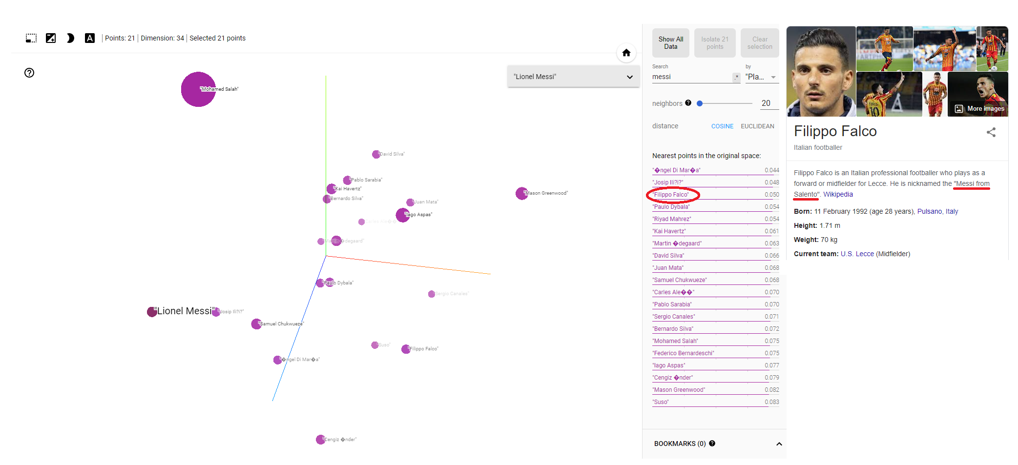
We’ll pinpoint Messi in our data and then list the n nearest players using either cosine or Euclidean distance, remembering we are in the original high dimensional space for this calculation (although it can be interesting note the relationships between players in PCA or UMAP space). Di María, Iličić, Dybala, Mahrez, Havertz - some wonderful players have indeed appeared at the top of the list. I have to confess I had not heard of the player sitting at number 3: Filippo Falco. Naturally a Google search followed which revealed he played predominantly in a second striker role for Lecce. And what about his nickname? That would be none other than the “Messi of Salento”. If there is a better method of model validation than that I have yet to hear it! (for clarity please do not validate production models using the nickname method)
There’s plenty of fun to be had if you’re that way inclined exploring players and their similarity scores. Aside from the fact we haven’t gone into too much trouble defining our input features (it was definitely more of a “kitchen sink” approach) we must not get too carried away with any similarity or lack of similarity we may see. The curse of dimensionality strikes now we are back in high dimensional space, so all may not be as it seems with the figures presented. This is particularly the case with the Euclidean and indeed cosine similarity measures (which are usually better for “sparse” data sets anyway).
For a production player similarity tool a thorough investigation would be required into how the number of dimensions used and the nature of the input data is affecting the similarity score. Indeed there are alternative distance measures that may be more appropriate which should be explored.
